Nowadays, individuals make greater use of their phones than any other device to connect to the internet. From looking at the news to online shopping, mobile phones have become the most convenient method of being connected.
For this reason, responsive design is more important now than ever before.
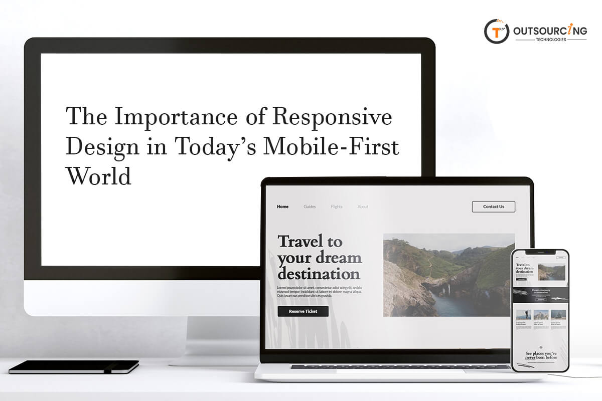
A website that works perfectly only on a computer is not enough anymore. If a website doesn’t load properly on a phone or tablet, people will leave it. It is a responsive design that works on any screen size.
The way people are using the internet has changed. Most users are on the web with mobile devices today. For this very reason, developers and designers need to start developing sites keeping in mind the first is mobile. It is known as the mobile-first strategy. Instead of creating a site for computers and then making it smaller, they create it for phones and then scale it up afterward. This way, mobile users are given the optimum experience. It also gets the site to load faster and look cleaner on tiny screens.
Having a good user experience keeps individuals on your site longer. If a website is not responsive, users have to zoom, scroll side-to-side, or deal with very small buttons that are difficult to tap. It is frustrating. A responsive design prevents this from happening. It makes the text readable, images show correctly and links easy to tap. This leads to users staying on the page and coming back in the future. A smooth experience on every device instills confidence and keeps customers smiling.
If a page takes too long to load, nobody is going to wait. They will shut it down and go to another page. A responsive design often makes the page load more quickly because it is built for mobile use. Speed matters. People want instant access to information. If a page loads quickly on any machine, it makes a good impression. It also helps with search rankings because search engines favor pages that load quickly.

Search engines like Google care about how individuals interact with a site. If a site is hard to use on a phone, it gets pushed lower in the search. That means fewer people view it. A responsive design makes sites appear higher in searches because it’s phone-friendly. Google even employs mobile-first indexing, so it looks at the mobile version of a website first and then the desktop version. A responsive website prevents you from losing traffic from search engines.
People switch from device to device throughout the day. They might look at something on their phone during a break, but then use their laptop at home. A responsive website has the same experience on any device. That is to say that individuals do not have to relearn how to use the website when they switch to a different device. It all appears and behaves in the same manner. It also means that your message will reach more people irrespective of how they are accessing your website.
New phones and devices are released every other day. Their screen sizes and features change every other day. A responsive design makes your site up to date with these changes. You don’t need to redesign your site every time there’s a new phone launch. The layout adjusts automatically. You’re ready for anything without extra time and money invested in updates. It also guarantees your users of having a good experience no matter the new devices.
Earlier, businesses used to build two separate locations ??? a desktop location and a mobile location. This was time-consuming and more expensive to maintain. A responsive location is just one that adjusts anywhere. This is cost-saving and less effort to keep it running. Updates have to be done only once. It’s simpler to maintain. In the long run, this is cost-effective and resource-effective while still giving the best experience to the users.

Too many sites still don’t take advantage of good responsive design. If your site is mobile-optimized and others aren’t, consumers will choose yours. They’ll spend more time and come back again. This gives you an edge. Getting ahead in design means you’re new, clever, and a wonderful way to be ahead of users’ needs. When you’re in a crowded online environment, this can be a significant impact factor. Standing out with a higher experience can lead to more traffic and more success.
In conclusion, making your website responsive is no longer a choice. It’s a necessity. The world is mobile-first now, and people expect websites to work everywhere. Responsive design is the simplest and most intelligent means of fulfilling this need. It makes users happy, enhances performance, saves cash, and aids in search ranking. Whether your site is a small blog or a large web business, optimizing your site to be responsive is one of the best things you can do today.